Film Review: Jurassic World

Our guest blogger is hobbyist film reviewer and writer Harry Casey-Woodward. This is the first in a series of posts in which Harry will be sharing his opinions on films he has watched. First up is his review of Jurassic World… 

Jurassic World, 2015, cert. 12A, dir. Colin Trevorrow, 2/5

‘Jurassic World’ confuses me. It’s a bad film but somehow it was awesome. It made me cheer along and cry big fat tears of nostalgia as well as grind my teeth in frustration.

The reason for my eroded teeth was how much this new film has dumbed down the franchise. The first film was also made for entertainment, of course, but it at least had some good science that the characters weren’t afraid to discuss. This might have been because Michael Crichton wrote the screenplay – and also wrote the original novel, which was even heavier on the science and chaos theory. The film was also a bit scary…

The new film tries to be scary. In fact, I wouldn’t even call it an effort. So scientists have created a new super predator that gets out of their control? How refreshing! For something that’s meant to be scarier than the T-Rex, the new Indominus Rex (created because the public are getting bored of average dinosaurs) doesn’t even look interesting. You could have given it horns, wings, anything!  What also doesn’t help is that the Indomimus and all the other dinosaurs were rendered purely with thoroughly unimpressive CGI (computer-generated imagery). I don’t remember seeing any animatronics. So, somehow, the painstakingly crafted animatronics and limited CGI the 90s film had, look more realistic and scary than anything Hollywood can do now. Hooray for 21st century filmmaking.

So along with dumb effects and plot, we get dumb characters setting gender representation back several decades. Everyone has fallen in love with Chris Pratt and he is fun to watch, but his character is a one-dimensional action man. He’s the rugged man of the wilderness who can do no wrong. Next to him, we get Bryce Dallas Howard playing the female lead. She plays a capable character who can act on intuition. However, she is presented to us as a woman too obsessed with work and profits to spend time with her nephews and only becomes a more positive character when she opens up emotionally, usually through tears, which Chris Pratt never shows. She is also meant to be laughable because she doesn’t know how to cope in the jungle and Pratt does. She is also the most sexualised heroine in the franchise. Sure, Laura Dern runs around in shorts and loses her shirt in the first film. But she doesn’t run around in high heels, chest heaving and glistening with sweat, clothing getting more dishevelled, while Pratt’s remain intact. Does this say something about the declining presentation of women in film over the last two decades, or the trashy nature of sequels?

I also got fed up with the amount of nostalgia we were expected to swallow: the classic score blasted out at every opportunity and the constant needless references to the better first film, which only reminded you that you could be watching it.

Yet despite all this tripe, I came out of the cinema bouncing with excitement like I’d dropped ten years. Although my inner voice was screaming that this was not an accurate representation of dinosaur behaviour, the whole film was still one big thrill ride. The action is impressive and even quite bloody at times, which made me wonder if it was suitable for the families who doubtless flocked to see it, or are kids more desensitised these days?

Nevertheless, it was still exciting to see what a working dinosaur theme park would look like and clearly the makers had fun imagining it. Although I hate to admit it, the plotline of a new super predator dinosaur being created just to keep the public interested is believable, as is one character’s belief in the military potential of the dinosaurs. Furthermore, although the film’s message is nothing new and it’s still about people running away screaming, at least it did some things different, such as making the ‘raptors capable of training, so they could be good guys for once.

It was never going to be as good as the first film. There are several things wrong with it, but it could have been much worse. Don’t expect much, but do expect a lot of fun. And dinosaurs.

Images from Empire Online 

Bulimia Charity Gives Game Characters Makeovers

Bulimia ‘a resource dedicated to providing information and treatment options to men and women suffering from anorexia, bulimia, and other types of eating disorders‘, have altered the images of infamous female game characters to represent a more realistic body image.

They argue that:

If video game creators are going to pride themselves on accurate digital representations, then it’s time for them to get real about women.

The charity explains how the changed images are based upon the average American female body, but is this enough? Do the changed images reflect average women? The new characters are more relatable to women, certainly, but they are still operating within a realm of fantasy.

What do you think?

Carey Fruth: Redefining ‘American Beauty’

Photographer Carey Fruth based in San Francisco has created a series of images titled ‘American Beauty’ featuring 14 women who are redefining the American idea of what beauty is. The images have been inspired by the 1999 film American Beauty and the rose petal fantasy scene in which Lester Burnham (Kevin Spacey) renders Angela Hayes (Mena Suvari) powerless with his male gaze.

The women pictured lie naked in a bed of lilacs and are of all shapes, sizes, ages and ethnicities. Unlike the film the women pictured are reclaiming their power and do not fit into the media-created body shape ideal, instead they are embracing their bodies just as they are.

Katie Edmunds Illustrates Things&Ink

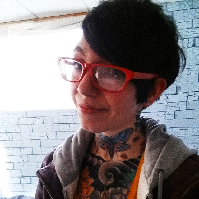
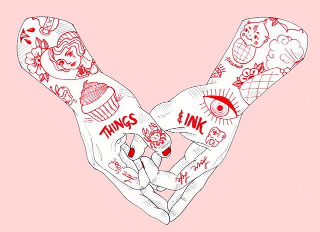
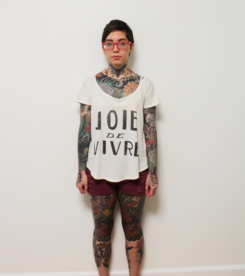
Fashion illustrator, Katie Edmunds from London, was inspired by Things&Ink magazine and created the original illustration (below) of blogger Yanin Namasonthi, who she has followed for a while and loves her style. 

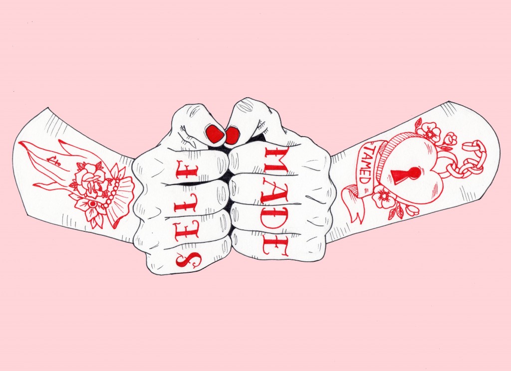
We chatted to Katie about her artistic style, where she gets her inspiration and of course tattoos. Katie has also recreated a few of her favourite previous Things&Ink covers… 

Do you have a background in art? Yes I’ve always chosen related art subjects through education and I’ve just recently graduated from London College of Fashion.

 How would you describe your style? I love illustrating people’s expressions through portrait drawings. I have a realistic style, which I tend to juxtapose with playful, and colourful elements through use of watercolours, adding a raw quality to my work.

What medium do you use? Pencils and watercolour. I like the precision and detail of the pencil and the unpredictability and possibilities which stem from watercolour and ink on paper.

Where do you get your inspiration from? I’m hugely inspired by female empowerment. My illustrations tend to play upon women who control and employ power over the male gaze, but with a tongue-in-cheek approach.

Do you have tattoos? So far I only have one, it was in the spur of the moment with my friend during St Patricks day in Dublin- a small celebration of a shamrock on my wrist. I keep illustrating different designs but as an illustrator I keep altering and changing what I want.

Are there any artists you admire? In terms of tattoo artists I really admire Keely Rutherford, like my own work hers is very colourful. I like her use of pastel colours and the way in which she translates that into tattoo art. I also like her fantasy aesthetic; it reminds me of Alice in Wonderland.

What drew you to Things&Ink? I was drawn to Things&Ink magazine as I feel it takes a look at both tattoos and the wider tattoo culture. Being an illustrator I really respect the artwork of tattooists so I love that it profiles the very best tattooists and shines a light on their illustrative skills. My work really focuses on feminist ideals so I was drawn to the strong women that are represented in Things&Ink magazine.

How did you decide which covers to draw? The first cover I chose to illustrate is my favourite of all the issues so far, issue 11 The Fruity Issue to me perfectly represents female empowerment. I love the bright and colourful aesthetic, which is something which I try to achieve in my work and I’m also really drawn to portraiture so I always tend to illustrate detail in faces.

 Can people buy your art? Yes,  I also do commissions and can be contacted by email katieedmundsillustration@gmail.com
Follow Katie on Instagram and Twitter for more art work